6 Tips to Creating Flyers Without Flaws
Have you ever heard the phrase... "The wise learn from other people's mistakes." It's actually very true.
If you're creating flyers for your small business, there are mistakes that can be avoided, if known beforehand.
So, before you hit "Print" and post that new flyer design, take a look at this list of blunders and mistakes so your next flyer can be a success.

Mistakes to Avoid When Creating Flyers
1. Hard to read text
A flyer's text can be hard to read if it's too small, printed in a light color, or written with a poor choice of font.
Don't use a font for the headline that may be hard to read at first glance. (See image below.)
Another rule of thumb is to limit yourself to two... no more than three fonts. That's because fonts... just like clothes, can be mismatched.

2. Missing contact information
Always remember to include the answers to the questions - Who? What? Where? When? and How? - that way readers know how to respond or reply to your flyer.
Once you cover the basics, double check that your information is correctly typed out.
3. A message that doesn't sell
You should make your words sell and answer the most important question in the consumer's mind which is, "What's in it for me?"
Pose a question that's on the minds of your potential customer and then answer it.
Or, mention a common problem your potential customer has and state how you, your services, and/or product would solve that problem.
Within these statements, strive to use power words. Power words are effective because they are proven to attract the reader's eyes and subliminally make a statement stronger.
4. A message that sells too hard
Don't you realize when someone is using their sales pitch on you?
What do you do? RUN!
When you write the copy for your flyer, look at it from the viewpoint of the reader.
Be balanced with how much you sell your product or business because you don't want to appear too pushy.
5. Misspelled words or grammatical errors
Check, check, and then recheck again. You can never proof copy too much. Check your name, number, headlines, and other text on the page.
I find it very helpful to ask a trusted friend, colleague, or family member to look over my text for errors.
6. Clutter (Your Worst Enemy and BIGGEST Blunder)
I repeat, DO NOT clutter your flyer. Why do I believe it's the worst mistake?
Because clutter makes any design unprofessional, undesirable, unreadable, and confusing.
How does design clutter happen?
When people are creating flyers, they tend to add anything and everything to it that they think looks nice and too much of it.
I'm talking about too many words, too many pictures, or too many design elements.
But think about it...
Can too many good things combined be a bad thing?
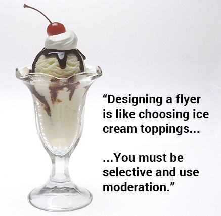
Here's an example... Ice cream is great! And with a few toppings like chocolate syrup and a cherry on top, it gets even better!!
But now, let's add some sprinkles... a drizzle of caramel... oh, don't forget the strawberries, pineapple, a few peanuts and pecans... and let's finish it off with whipped cream.
(Are you imagining you have sugar overload from the example?)

All these
things are great alone, but altogether it can be one undesirable mess.
Well, the same is done when you clutter your flyer. Possible customers or clients won't bother to read or keep the flyer.
So, what can you do to combat that?
One last word of advice...
Prevent the above from happening by learning to utilize white space.
Most of the time people will try to fill space because they believe that
everything must be filled, but... that's not true!
In graphic design, white space is a term used to refer to the area(s)
of a layout that's left unmarked or unused to visually separate
elements.
The next time you create a flyer try to use one or two focal pictures, then organize the most important info around those focal points. Use short paragraphs or bullet points to space out information in a quick and easy to read format.
If you follow the tips above, you'll be all set to create a better flyer for your small business!
Related Articles:
5 Elements of an Effective Flyer
10+ Ways to Make A Flyer Stand Out
11 Beautiful Flyer Design Ideas for Inspiration
6 Common Mistakes Made When Creating Flyers Return to Top
Back to Creating Flyers That Work
Recent Articles
-
What Makes A Good Website - Elevate Your Site Above The Competition
May 20, 23 09:21 PM
A good website is not just about the design. It's a combination of 4 key elements that must be skillfully implemented. -
Ways to Create Unique Business Cards
Jan 07, 23 06:06 PM
Having unique business cards is definitely a way to make your business stand out of the crowd. Here are some ways to transform your business cards into one-of-a-kind. -
7 Completely Free Stock Photo Websites With No Restrictions
Nov 28, 22 11:30 AM
New photo resource added the the list of 7 free stock photo sites for commercial use.
