Unique Examples of Business Cards
From 70 Creative People
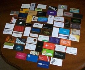
Here I show off some good examples of business cards that are truly unique.
If you are a graphic designer in need of design inspiration or a small business owner about to create your own business cards, this is for you!
On other pages of this site, I have shown other examples of business cards but this group is special. Why?
These are graphic designers' business cards. So, you know these have to be unique.
About the Business Cards Featured
Back around March 2010, I signed up to participate in a cool Business Card Exchange initiated by Meredith Marsh.
The exchange was between graphic designers like myself, who wanted to network with others, swap cards for the fun of it, or see cool examples of business cards from other designers.
For whatever reason each designer participated, I think all of us truly enjoyed the experience.
"Tricky" Textured Examples of Business Cards
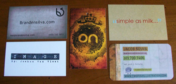
I liked how these cards incorporated detailed textures into their designs. Textured graphics makes business cards look three dimensional and interesting. Sometimes they can even trick the eye at first glance into thinking the effect on the paper is real.
This photo just gives you a little glimpse into how they look, but in real life they look even better.
"Standing Tall and Sticking Out" Vertical Business Cards
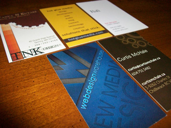
These vertical cards stuck out of the bunch because they are oriented differently. If you are looking for an affordable way to make your card stand out, vertical cards are the way to go.
"Large and In Charge" Enlarged Logo Business Cards
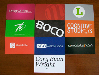
I like the bold statement these business cards give. The logo is prominent on the backside and stands out with a bold color. Cards like these, are great for businesses that have a firm brand and like to make their business name prominent.
"Clean and Crisp" Minimalist Business Cards
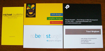
I categorized these business cards as minimalist because of their clean and open look. They are straight to the point and have a clear message. Too, I like how these cards look fresh.
"Personable" Photo Business Cards
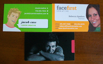
Many people ask me whether it is okay to have their picture on their business card. I feel that it ultimately depends on what type of industry your in. As far as these graphic designers are concerned, I think they made a good choice. Their business cards look friendly, welcoming, and personable.
"Sleek and Chic" Glossy and Spot UV Business Cards
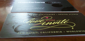
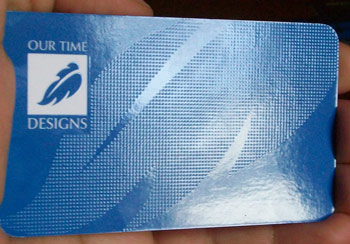
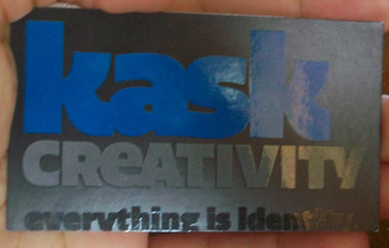
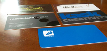
I love Spot UV business cards! These designers used Spot UV to create patterns and text. These cards were a little hard to capture with the camera but I did my best because I didn't want you to miss these. (If you think they look good in these pictures, just imagine what they look like in person!)
"Classy" Unique Business Cards
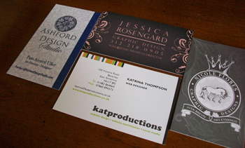
These cards have a classic and/or regal style. Each has a design that expresses the individual company but also has a classic and clean polished look.
"Cool, Not Square" Rounded Corner Business Cards
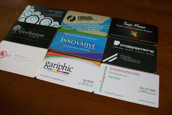
Rounded corners are another neat way to make your card stand out. There were several business cards in the bunch that had rounded corners (including mine, in the middle). Each card had its own cut; some just have a little shaved off the edges and some are more rounded than others. Either way they are all unique examples of business cards!
"Different Shapes, Different Sizes" Custom Cut Business Cards
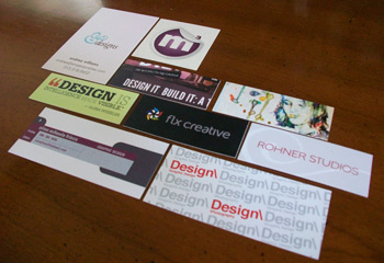
This group consists of mini cards, square business cards, and other specialty sizes. Though the cards may be small, their designs speak a bold statement. You can never go wrong with a unique sized business card paired with a great design!
"ImPressive" Letterpress Business Cards
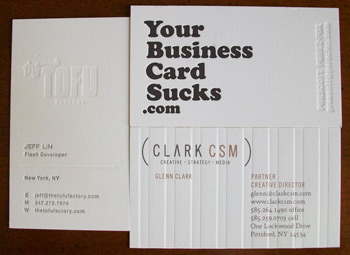
These cards are neat because the words are impressed. The bottom has a unique ridged quality paper has a similar effect to letterpress cards and that's why I included it in this group. I love the texture of cards that have impressions in them.
"Read All About It!" Informative Business Cards
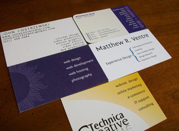
I call these cards informative or resourceful because it includes what they do on the back or side of the card. There are always cases where someone doesn't know exactly what your profession is, especially when you're a graphic designer, but by having your services listed you cut out some questions some people may feel afraid to ask.
Other Stand-Out Business Cards
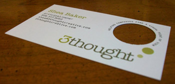
This card was the only one that had a cutout. Neat!
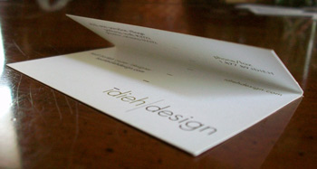
This was the only foldable business card. Another cool idea!
My Favorites
These are my favorite examples of business cards in no specific order. But before I explain why these are my favorite, I want to say that all the examples of business cards were neat in their own way.
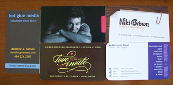
Hot Glue Media's card is in my top 5 favorite because of the overall concept. I like the fact that the design and slogan tied together nicely to create a good message (I wish I had thought of that slogan, "Solutions That Stick" - Hot Glue Media).
Jacob Cass' business card is in my top 5 because his card and website is very personable and ties together well also.
I liked Niki Brown's and Cathy Olson's business cards because of the spot UV coating and branding they did.
Lastly, I choose Artiatesia Deal's card because it was very practical to list what services she offers as a graphic designer and I think prospective customers would find it helpful (I included a short list on my card too).
And, since I'm on the subject of my card, this is how it looks. (Below) I felt that it was necessary to put my graphic design services on my business cards because when I mention graphic design I usually get a blank stare or the words "Oh..., okay". At that point, I do explain what I do more in detail but, for those times when someone picks up one of my cards when I am not present my card "speaks" for me.
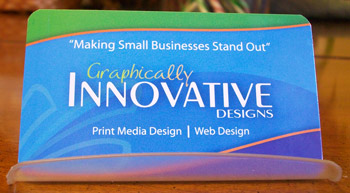
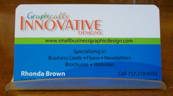
Overall, I felt that the business cards from the exchange looked great and I hope that I can participate in another business card swap in the future!
By the way, if you want to see what others had to say about the swap and more examples of business cards from the swap, here is Meredith's original post about the first business card exchange that inspired her: Meredith Marsh's Original Video Post
Recent Articles
-
What Makes A Good Website - Elevate Your Site Above The Competition
May 20, 23 09:21 PM
A good website is not just about the design. It's a combination of 4 key elements that must be skillfully implemented. -
Ways to Create Unique Business Cards
Jan 07, 23 06:06 PM
Having unique business cards is definitely a way to make your business stand out of the crowd. Here are some ways to transform your business cards into one-of-a-kind. -
7 Completely Free Stock Photo Websites With No Restrictions
Nov 28, 22 11:30 AM
New photo resource added the the list of 7 free stock photo sites for commercial use.
